Tread Magazine
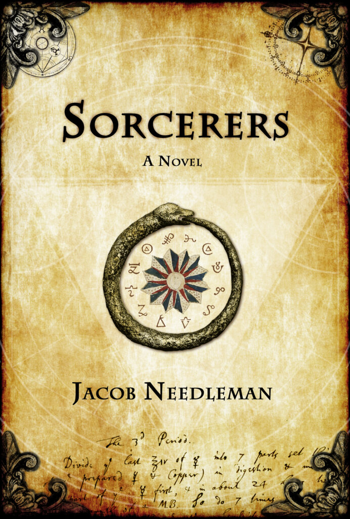
Tread Magazine was my introduction and training in graphic design. It was an excellent, and unusually public, opportunity to explore ideas and learn. This is the cover of the fourth and final issue.
It always troubled me that all magazines tend to look more or less the same. There’s a format, and I don’t see any reason for there to be a format. The magazine, generally speaking, seems to me a perfect canvas and vehicle for creating and distributing art. Why stick to a grid. Especially in the modern digital age when information can be much more efficiently dispensed via electromagnetic radiation. Physical paper and ink should be used to create something that will last a while.
When the opportunity arose to make this magazine I was dirt poor living in a cockroach infested house with twelve other BMX bikers, riding my bike every single day. I had become friends with two fellow riders in the industry who made BMX videos, which they marketed as a video magazine. We were talking about the state of current BMX magazines, I thought I could do better, and they offered me the chance.
So I moved in with them in the Chicago area, slept on their living room floor for nearly a year, and worked in a warehouse during the day while I figured out how to make a magazine. It was a step up, there were no cockroaches in their house.
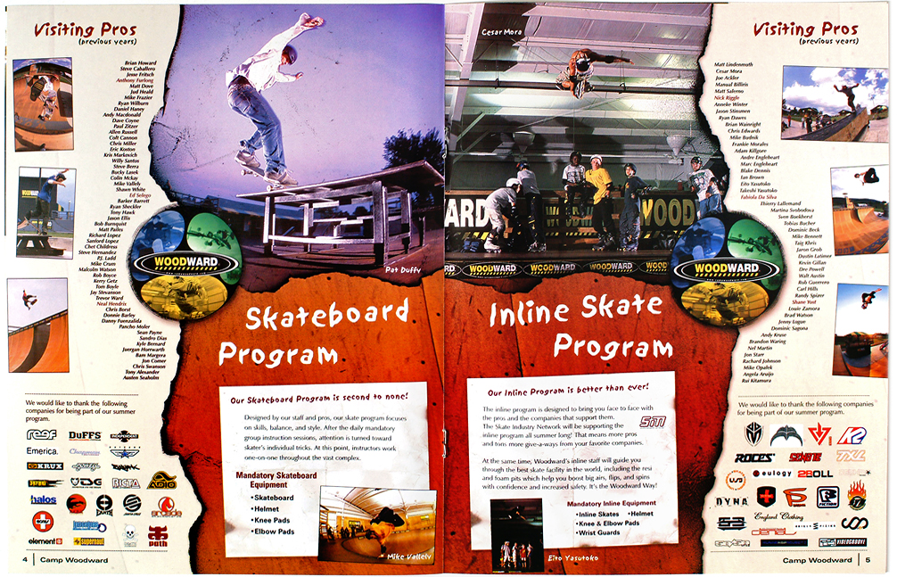
This spread is from issue #1. If I could redesign it now I’d put the text in more traditional blocks (maybe?). Pure experimentation. I never studied design, nor art in general, and my sensibilities were not traditionally refined. I was a student of 80’s bike and skateboard culture, and perhaps the design reflects the gritty freedom of those pursuits.
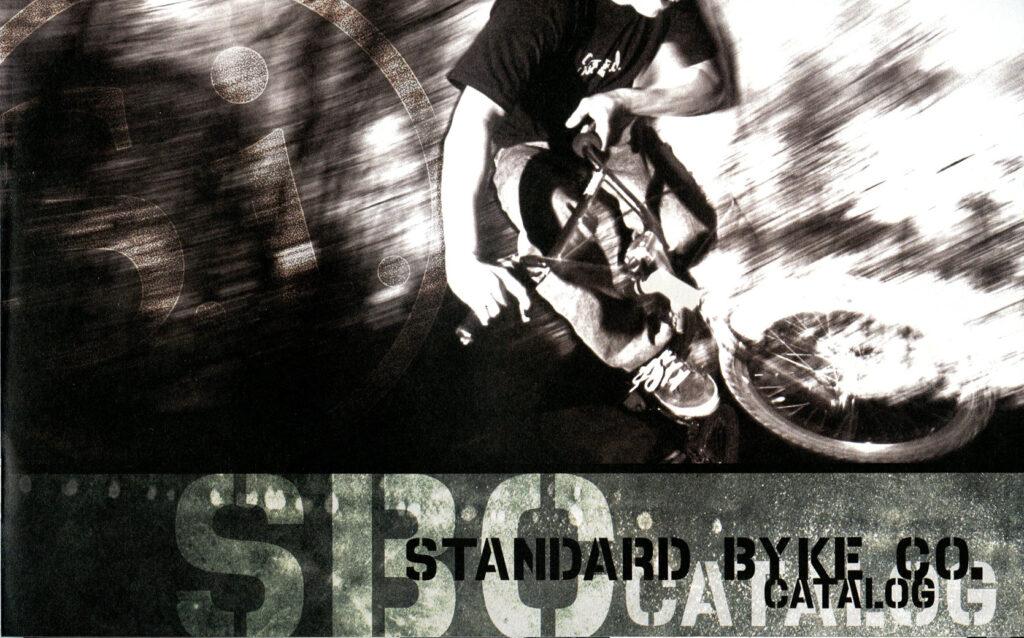
An article I made to honor some of those whom I considered to be part of my tribe, the artist BMX’ers. Sandy, featured in the photo, has become a successful photographer with a unique Scottish view of the world. After Tread Magazine folded I took some of my work and talked to the art director at Bicycling Magazine. He said some interesting things, in particular he liked this spread and told me that he was going to appropriate some of my ideas. He also lamented when I told him I was newly married, and he told me that marriage ruins an artist. Culture and opinion.
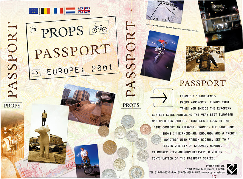
Another opening spread. To try and keep costs down I had very few color pages to work with. I like the contrast here between color and black and white. Also I always liked that a spread should spread, that it should flow across the gutter. I doubt I formalized that idea with words, but it lived intuitively in my mind.
Pages three and four of the preceding article. I went sort of traditional here. The text could be cleaner for sure. I don’t think I was concerned very much with legibility, rather I considered the text to be another design element. I still like that as a guiding principle, but I think that now I would spend a bit more time making the text more elegant.


